

From volcano plots to biologically stratified effect plots in proteomics
In my previous article on volcano plots, I elaborated on why I think volcano plots receive more attention than they deserve. This sparked a lot of interesting discussions and showed that almost everyone in the proteomics community has an opinion, even though it is “just a plot”. Some find volcano plots useful in their everyday work (e.g., for QC or a high-level overview), some tweak them a little bit, some find them distracting at best and rely on something else entirely.
While volcano plots do an okay job of getting a QC-type overview of what happened in your experiment and everyone knows how to read them (bandwagon effect), there are many downsides. First, they show thousands of data points that you do not care about. Second, p-values get too much emphasis (i.e., what is the practical difference between p=0.0001 and p=0.000001?). Third, they only visualize the readout itself without any biologically meaningful context. This is also what a substantial part of the community thinks.
But how do you fix these issues? I want to provide three alternatives from a practitioner’s perspective.
The quick fix: use-case-specific annotations
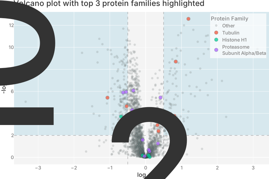
Sometimes you have to use volcano plots because your audience expects it. In this case, you can at least annotate your data points. My recommendation is to just show the annotations that you care about the most. There is obviously no objectively best annotation; it always depends on your experiment and its goal. This might be KEGG pathways, GO terms, subcellular localization, other assay data or something else entirely.
Below, you see an exemplary volcano plot with PANTHER protein families annotated: this allows you to quickly gauge effects at the evolutionary / structural level. Only highlighting the most interesting families (multiple differentially expressed proteins, in this case) prevents your audience from being overwhelmed by too many colors.
While annotations add some biological meaning, they do not make the thousands of data points shown less irrelevant or the p-values more practical.
The QC alternative: MA plots
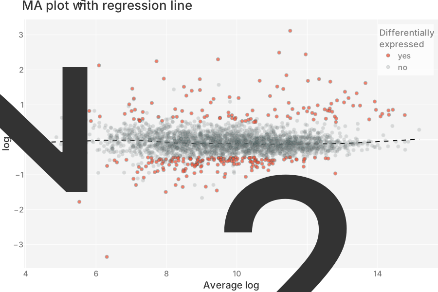
If quality control is your primary aim, the MA plot is the alternative for you. It plots the log fold change (M) vs. average log intensity (A). This brings in a new dimension besides the relative intensity change between treatment and control: the absolute level of the intensity.
Normally, you would expect your data to be centered around M=0 across all intensity levels. If that is not the case, you know that something is off. Your normalization might be at fault, or you might have run into technical issues like ion suppression or detector saturation. No matter what the cause is, you know that you have to dig deeper and fix your experiment first.
Take the MA plot below for example. It features the exact same data as in the annotated volcano plot plus a LOWESS regression line. While our data is indeed centered around M=0 for most intensities, the higher intensity ranges have rather few negative fold changes (as shown by the upward-bending regression line on the right). If these proteins would be of interest, digging deeper would be advised. The volcano plot above does not make this stand out because it is simply unaware of absolute intensity levels.
While MA plots are great for QC, the thousands of irrelevant data points remain an issue.
Retiring the volcano: biologically stratified effect plots
What I find most jarring about volcano plots is that they only show isolated single-protein effects and do not reveal any patterns (e.g., at family-level). Why is this relevant for proteomics? It is surprisingly simple: proteins rarely change alone. The introduction of, say, a small molecule triggers complex cascades in cells, so our analysis should reflect this complexity. There is only one way to solve this fundamental issue of volcano plots: group, summarize and then zoom in on what is interesting.
First, you need groups that reflect your experiment’s goal and tie into the biological aspect you want to analyze. Second, you need summary statistics that represent the effect you want to mine. They do not need to be complex, simple counts and averages often prove effective. Third, you have to decide on what is interesting. Again, simple, well chosen thresholds often suffice.
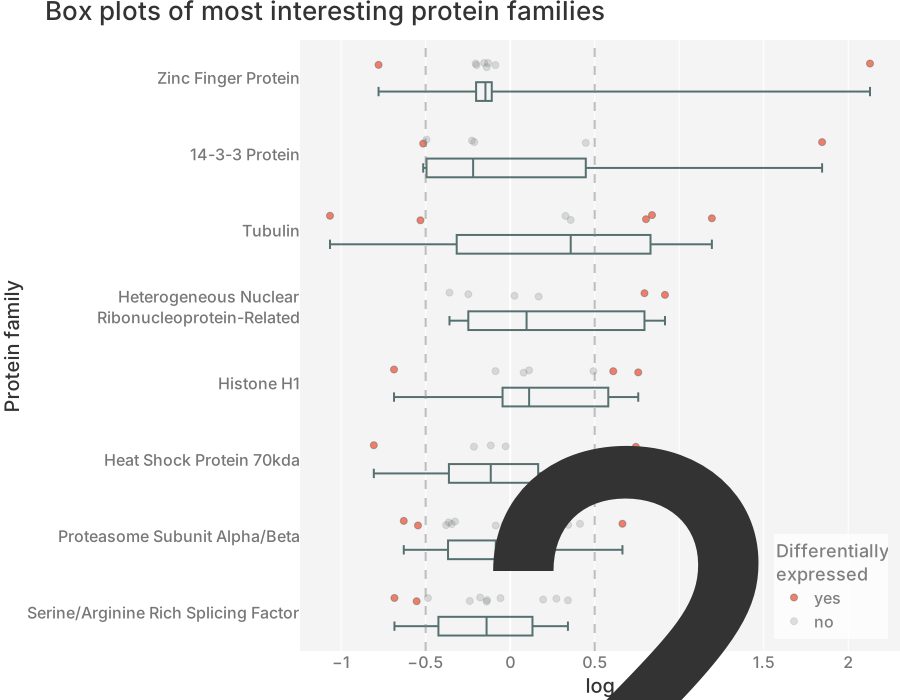
Now, you need a visualization that lets you compare both the groups as well as the data within the groups. For me, the old-school box plot with the underlying data points overlaid does the trick.
Below, you see exactly that plot for the most interesting protein families of the dataset used for the volcano / MA plot above. One overall pattern quickly becomes clear: Some protein families show both differentially under-expressed and over-expressed proteins. I bet you did not spot that in the volcano plot above. This just shows that a little extra work immediately gets you more insights into what you want to understand: the biology (and not volcanoes).
Why this matters
Helping scientists understand their proteomics data better and faster is what I’ve been doing for the past 4+ years. To really make the most of your precious proteomics data, I believe that designing the analysis pipeline and finding the right visualization is just as important as configuring your instruments. I hope after reading this, you feel the same.
As with my previous article, I do not believe that I have all the answers, so I would very much like to hear what you think. What is your take on these three alternatives to volcano plots? Have you used one of them before or are you doing something else entirely? Either way, feel free to drop me a line!